Design System
Living style guide for global design tokens
Update globals.css to change these globally
Logo Variations
Main logo in different sizes (icon + text included in SVG)
Large (320x96px)
Medium (240x72px) - Header/Footer
Small (160x48px)
Large (320x96px)
Medium (240x72px) - Header/Footer
Small (160x48px)
Branding Assets
Central asset management - drop files in /public/branding/ to update
Logos
/branding/logos/main-logo.png
/branding/logos/main-logo-Dark.png
/branding/logos/icon.png
Meta/Favicon

/branding/logos/favicon.png
/branding/logos/og-image.png
/branding/logos/og-image-dark.png
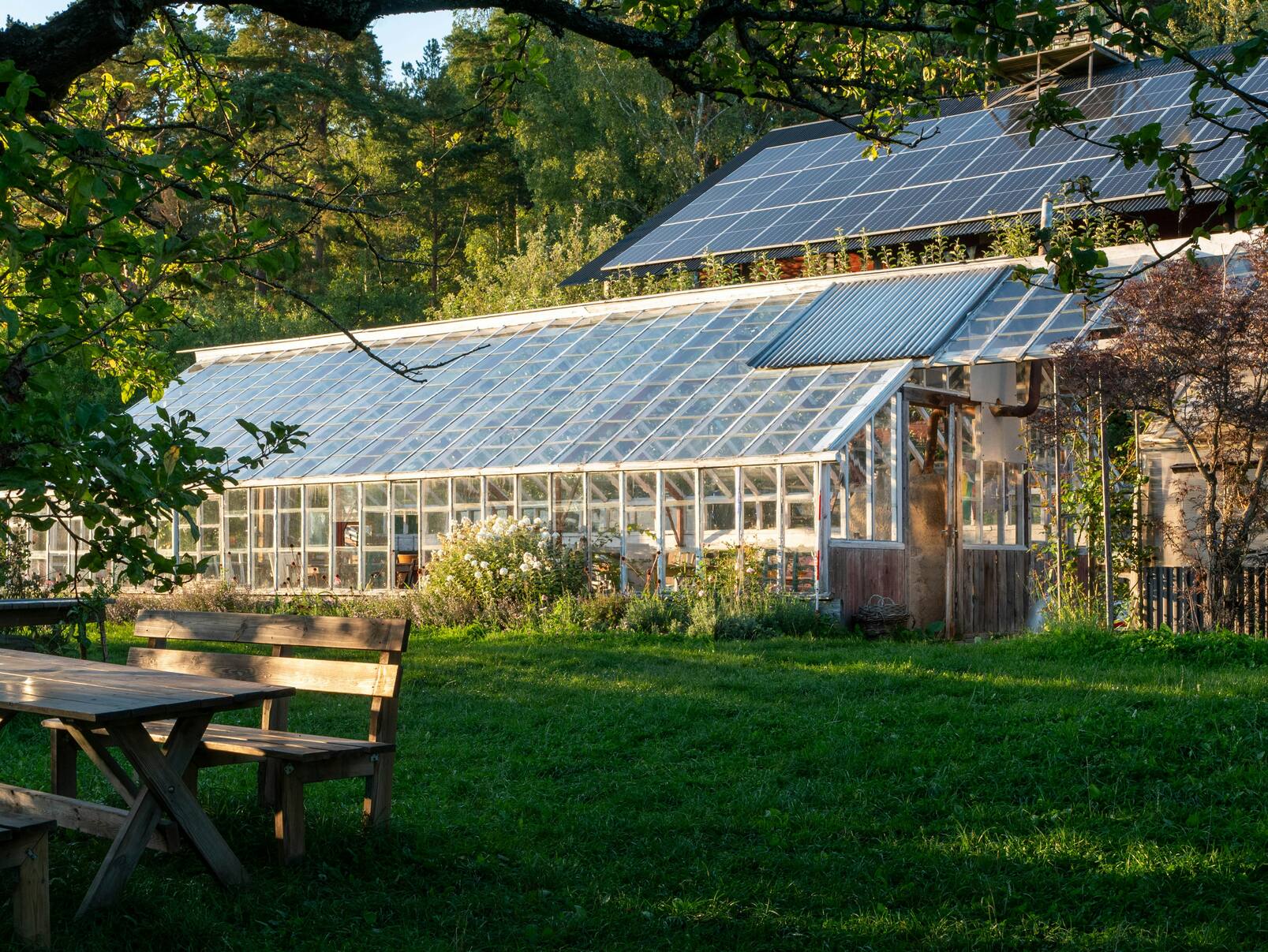
Brand Images

/images/hero-background.jpg
/images/facility-exterior.jpg
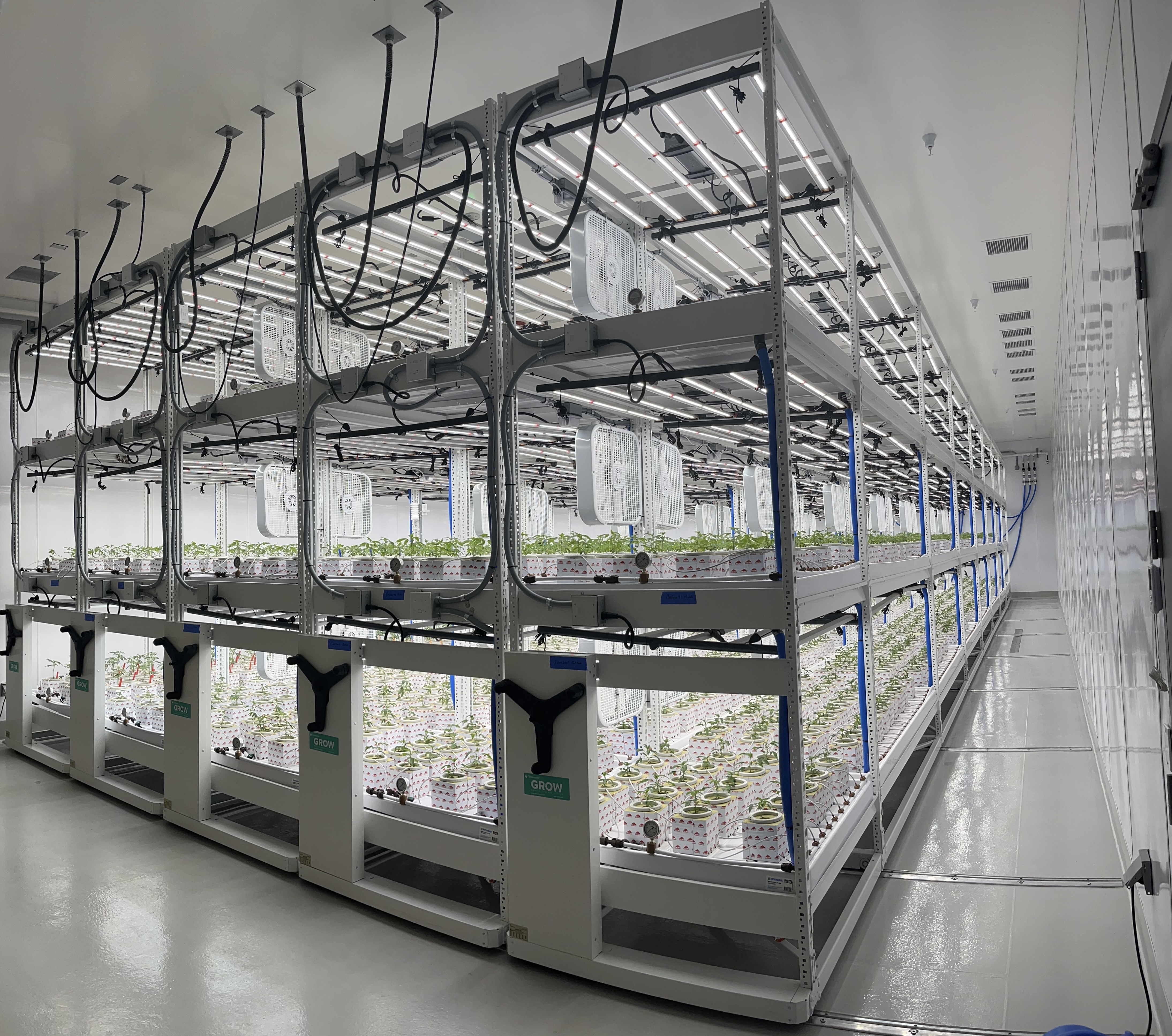
/images/facility-interior.jpg
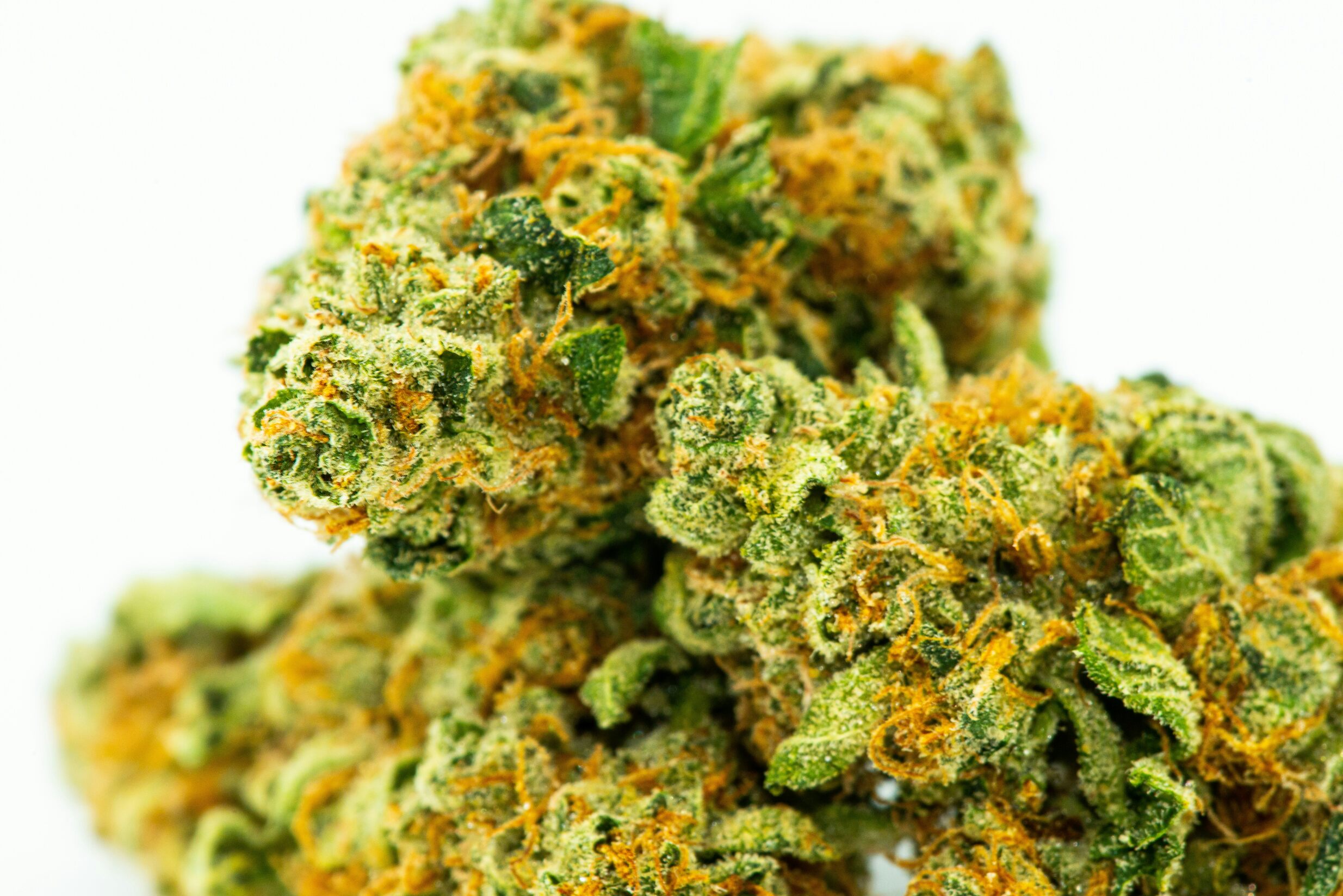
/images/product-hero.jpg
Videos
/branding/videos/hero-video.mp4
/branding/videos/facility-tour.mp4
/branding/videos/cultivation-process.mp4
Color Palette
Monterey coastal agriculture inspired colors
--primary45 23% 55%#9D9271Use for: Primary buttons, backgrounds, brand elements
--secondary75 43% 50%#8EBE4BUse for: Growth indicators, success states, plant-related elements
--accent193 43% 62%#72BACBUse for: Highlights, hover states, water/coastal elements
--background40 27% 95%#F7F3EDUse for: Page background, cards, surfaces
--foreground0 0% 10%#1A1A1AUse for: Body text, headings, dark backgrounds
--muted40 22% 85%#D9D0BCUse for: Disabled states, backgrounds, subtle dividers
Color Shade Variations
Full shade palette (50-900) for each brand color • Use: bg-primary-100, text-accent-500, etc.
50
primary-50100
primary-100200
primary-200300
primary-300400
primary-400500
primary-500600
primary-600700
primary-700800
primary-800900
primary-900Usage: bg-primary-100, text-primary-600, border-primary-300
50
secondary-50100
secondary-100200
secondary-200300
secondary-300400
secondary-400500
secondary-500600
secondary-600700
secondary-700800
secondary-800900
secondary-900Usage: bg-secondary-100, text-secondary-700
50
accent-50100
accent-100200
accent-200300
accent-300400
accent-400500
accent-500600
accent-600700
accent-700800
accent-800900
accent-900Usage: bg-accent-100, text-accent-600
Gradient System
Subtle shade-based gradients for section backgrounds
gradient-primary-subtlegradient-primary-softgradient-primary-mediumgradient-secondary-subtlegradient-secondary-softgradient-secondary-mediumgradient-accent-subtlegradient-accent-softgradient-accent-mediumgradient-coastal-sunriseEarth → Water
gradient-coastal-meadowGrow → Earth
gradient-coastal-oceanWater → Grow
gradient-coastal-mistThree-color fade
gradient-primary-radialgradient-accent-radialgradient-darkBlack → Dark gray with earth tones
gradient-dark-softSofter dark gradient
Typography
Type scale using Geist as the main typeface
The Quick Brown Fox
Use for: Landing page heroes only • Font: Geist • Color: secondary-700
Premium Cannabis Cultivation
Use for: Page titles, main headings • Font: Geist
Our Growing Process
Use for: Section headers, major sections • Font: Geist
Coastal Kush Strain
Use for: Card titles, sub-sections • Font: Geist
We cultivate premium cannabis using sustainable coastal agriculture methods, combining traditional expertise with modern technology.
Use for: Lead paragraphs, introductions • Font: Geist
This is the standard body text size. It should be comfortable to read for long-form content and maintains good readability across all devices.
Use for: Body copy, descriptions, general content • Font: Geist
Smaller text for captions, labels, and secondary information. Still readable but takes up less space.
Use for: Captions, labels, helper text • Font: Geist
The smallest text size. Use sparingly for fine print and legal disclaimers.
Use for: Fine print, disclaimers, metadata • Font: Geist
Spacing Scale
Modular spacing system for consistent layouts
Components
Interactive component examples from our design system
Variants
Sizes
Rounded Variants
Features: 3-step gradients (600→700→800), glossy overlay effect for premium appearance
With hover effects and border animation
Clean and simple card layout
With custom border color
Border Radius
Coastal rounded style for components
rounded-sm
2px
rounded
4px
rounded-md
6px
rounded-lg
8px
rounded-xl
12px
rounded-2xl
16px
rounded-3xl
24px
rounded-full
9999px
Shadows
Elevation system for depth and hierarchy
shadow-sm
Small
shadow
Default
shadow-md
Medium
shadow-lg
Large
shadow-xl
Extra Large
shadow-2xl
2X Large
Design System Notes
This style guide is a living document. All design tokens are defined in src/app/globals.css. Update the CSS variables there to make global changes across the entire application.